6.3.3. The Share of Median Income in Total Income, L90/10, and L75/25
The figure below summarizes the estimates of three indicators by region and annually from 1965 to 2003: 1) the percent share of median income in total income, 2) L90/10 or the ratio of the income share earned by 90 percent of the population over the income share of the bottom 10 percent of the population, and 3) L75/25, the ratio of the income share held by 75 percent of the population over the income share of the bottom 25 percent. The same legend applies to each region i’s curves.
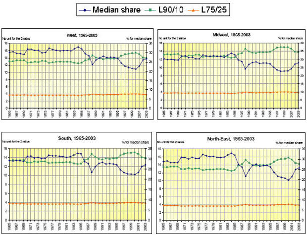
The primary axis has no units as it represents the two ratios L90/10 and L75/25, whereas the secondary axis (on the right of each graph) displays percentages for the median share in total income.
For all four regions, the two ratios remain fairly constant from 1965 to the mid 1980s, reach a sudden peak in 1988, and then display a very smooth cycle with a downward trend from 1988 to the mid 1990s, and an upward trend culminating in year 2000. The trends of L90/10 and L75/25 are clearly alike, suggesting that similar inequality dynamics occur both in income classes of low- and wide-inequality gaps (L75/25 and L90/10, respectively). However, this conclusion is questionable because the Pareto assumption on the functional form of the Lorenz curve is applied to the entire income distribution.
Among all states and years, the L75/25 ratio varies between 3.57 and 4.08, suggesting that the variable fluctuates within a very narrow band; likewise for L90/10, in a lesser extent. This apparent stability can be misleading. The actual fluctuations mean drastic changes in income shares, as suggested by Figure 6.7, showing the L75/25 curve in the case of the Northeast region.
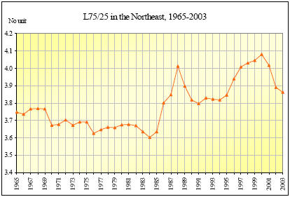
Consider one state in the Northeast region, say Massachusetts. According to the Massachusetts’ Lorenz curve, the wealthiest 25 percent of the household population (labeled L0-25) earned about 14.5 percent of the total state income in 1978. Meanwhile, the wealthiest 75 percent of the household (labeled L0-75) earned 52.9 percent of the state income, which means that ratio L75/25 was of 3.7 that year. The same variables in 2000 recorded the values of 7.4 percent of income share for L0-25, 30.8 for L0-75, and therefore 4.2 for ratio L75/25. With L75/25 increasing by 0.5 (= 4.2 – 3.7) ‘only’, the share of the wealthiest 25 percent almost shrank by a half, from 14.5 percent in 1978 to 7.4 percent in 2000, which is a drastic change. Meanwhile, the income share of the wealthiest 75 percent of the household population did not drop as sharply as the L25 share (from 52.9 percent of income in 1978 to 30.8 in 2000, which is far above 26.5 percent, or 52.9 / 2).
The same type of comments applies to the L90/10 ratio. In 1975, L90/10 coordinate slight exceeded 13.1 in the South. The same ratio in 1988 was 14.8. This increase from 1975 to 1988 does not seem to be much at the first glance. Considering the definition of the ratio (L90/10 = L0-90 / L0-10), it appears that L0-10, the share of the bottom decile in total income, decreased from 5.3 percent in 1975 to 4 percent in 1988. Expressed in dollars of 2003, the total income for all Southern states was about $75,897,000 in 1975, and 5.3 percent of that total represents slightly more than $4,030,000. Similarly, 4 percent of $119,427,000 in 1988 represents about $4,729,000. This means that the poorest 10 percent of the population experienced an overall increase by less than $700,000 from 1975 to 1988. From the top decile perspective, however, L0-90 is 69.6 percent in 1975, and 58.5 percent in 1988. Therefore, the richest 10 percent benefited from an increase by $17,088,000, from $52,824,000 in 1975 to $69,913,000 in 1988. The full calculation process is summarized in Table 6.1.
| South | L90/10 (a) |
L0-10, % (b) |
L0-90, % (c) |
total income,$ (d) |
$Y0-10 (b) * (d) |
$Y0-90 (c) * (d) |
| 1975 | 13.12 | 5.31 | 69.60 | 75,896,796 | 4,030,120 | 52,824,170 |
| 1988 | 14.82 | 3.96 | 58.54 | 119,426,905 | 4,729,305 | 69,912,510 |
| difference | 1.70 | 43,530,108 | 699,186 | 17,088,340 |
In a nutshell, the income of the richest 10 percent increased 24 times faster than that of the poorest 10 percent in the same time 42 , and this what an increase by 1.7 in L90/10 means.
Among the former studies released on this topic, one is conducted by the Center on Budget and Policy Priorities and the Economic Policy Institute (2000). The authors of the report used non-annual data from the Census Bureau’s March Current Population Survey, and measured the inequality gap with the ratio between the richest quintile and the poorest quintile (Q80/20). The authors focused on two time periods: one short (1988-90 versus 1996-98), and one long (1978-80 versus 1996-98), but do not comment on the intermediary range 1978-80 versus 1988-90. The results shown with the L90/10 ratio estimation do not perfectly fit their short-term and long-term analyses, but the trends toward a wider inequality gap look alike.